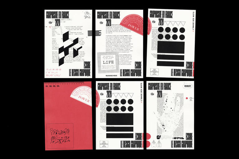
Graphisme en France Issue 27

How does graphic design contribute to a greater cohesion, understanding, and harmony of the society in which we live? How does it allow us to better circulate, better educate, better understand and better interact with others? How does it allow us to enhance the environment in which we live, making it richer, more respectful, more interesting?
In these turbulent times, it is necessary to consider the fundamental impact of graphic design on our society. Graphic design is more than ever concerned with public utility, and social design opens up possibilities of reaching broader organizations and audiences. Forms, images and signs compose and structure our everyday life, our imaginations, shaping our critical spirit.
Max Bruinsma, a Dutch art and design critic invites us to look back at a number of emblematic creations that embody their authors’ commitment to design projects in the service of society.
Élodie Boyer, publisher and consultant, guides us according to the objects, signs and devices found in her daily surroundings that have forged her gaze and that attract her attention. She invites us at the same time to appreciate the interest of these forms that constitute our common visual culture.
Finally, Éloïsa Pérez, graphic designer, typographer and teacher, in parallel to her thesis on the uses of typography in handwriting, proposes a contribution that addresses the importance of considering the tools of graphic design and typography in schools and in all systems related to the transmission of knowledge and teaching.
Despite the global health crisis and the heavy restrictions that came with it, numerous events have been organized, in particular on-line, by distributers and practitioners of graphic design and typography.
Marion Caron and Camille Trimardeau, both graduates of the École supérieure d’art et design Le Havre-Rouen, created Studio Béton in 2021. They have designed this issue with all of the attention that they bring to the materiality of the book and its elements – paper, binding and printing. They composed the issue according to a modular grid adapted to the content contained within, and have chosen to use the typefaces Boogy Brut by Bureau Brut and Julien Priez (Bureau Brut), Matter Medium by Martin Vácha (Displaay) and Immortel Vena G2 by Clément Le Tulle-Neyret.
Also available on the Art, Book, Magazine (ABM) digital library app.


