A text by Alice Savoie
To study the plurality of the animal world for the purposes of creating a new type family: this is the surprising ambition
of
Faune that you can discover on this website.
Though natural history has had a strong influence on literature, poetry and painting, its impact on typography is still quite
limited. Admittedly, the floral side of Art nouveau prompted a number of typefaces and ornaments such as those
designed at the start of the twentieth century by
Eugène Grasset and
George Auriol for the G. Peignot & fils foundry; but why has the diversity of animal species, teeming with
morphologies, behaviours and rhythms, not been explored before now?
Faune’s reason for being is to attempt to fulfil this mission of proposing another manner of designing and
combining typefaces, based on an encyclopedic visual knowledge that is transmitted by book history.

Reinventing the notion of a typeface family
At the origin of this second typographic commission, initiated by the Centre National des Arts Plastiques, this time in partnership
with the Imprimerie Nationale, is a question: what would a contemporary and forward looking vision of the type
family look like?
For over five centuries, the typographic palette available to us has been constantly expanding: blackletter and roman typefaces,
then italic and bold variants, with or without serifs, multi-scripts, for continuous reading or titling… This
variety demonstrates our ability to ceaselessly reinvent our relationship with letterforms, and with the text.
More than a testament to creativity, this phenomenon also reveals an increasing desire for rationalization: type
designers have made numerous attempts to name and classify this aesthetic diversity, and to have some control
over the possible combinations that can be made between different type styles; they have also repeatedly criticized
the hybridizations to which typefaces have been subjected.
The paradigm shift that is currently occurring, fostered by (among other factors) the diversification of mediums that enable
us to read and write, has forced type designers to come up with a typographic palette that is adapted to this
diverse and constantly changing environment. The most frequent response that is provided today is the development
of vast homogeneous sets of typefaces, with multiple gradations of weights, of widths, of optical sizes, etc.,
that users are invited to draw from to meet their needs.
Going against this process of expansion,
Faune wishes to challenge this evolution by proposing an approach that is invested with formal diversity
and unexpected crossovers.


A collaboration with the Imprimerie Nationale
This new typeface commission is also a rare opportunity to collaborate with the Imprimerie Nationale and the
Atelier du Livre d’Art et de l’Estampe, and to rediscover its long established patrimonial collections. The
Cabinet des Poinçons stands out as a top tier collection, but it is also worth noting the impressive collection
of books published by this establishment (that would successively be called Imprimerie Royale, Imperiale and
then Nationale) since its foundation in 1640 on the initiative of Cardinal de Richelieu.
Faune has its source in two scientific masterworks. The first,
Histoire naturelle, by Georges-Louis Leclerc, Comte de Buffon, was published between 1749 and 1788 by the
Imprimerie Royale. Buffon was one of the forerunners of comparative anatomy, being among the first to establish
a link between different physiologically similar species, organizing them into families with a biological unity.
He is thus credited with having foreseen a number of modern ideas on the variability of species and “evolutionism”.

This impressive body of work compiled by Buffon and his collaborators, divided into four series, spread out over 36 volumes
and richly illustrated, represents a crucial step in the constitution of natural history as a major science in
France. The associated engravings give a finely detailed account of the morphological variations that exist between
species. They have also contributed to making it a timeless work of reference, one that continues to fascinate
despite the fact that the texts that they accompany have long since been surpassed.
The second is the monumental
Description de l'Égypte ou Recueil des observations et des recherches qui ont été faites en Égypte pendant l'expédition
de l'armée française. It was published by the Imprimerie Impériale (later Royale) between 1809 and 1830
and constitutes the first scientific description of ancient and modern Egypt, spread out over 9 volumes of text
and 14 volumes of plates. It signals a major event in French publishing, one of the most ambitious endeavours
ever undertaken by the Imprimerie Nationale. Even though it is not strictly speaking a history, like that of
Buffon, the
Description de l’Égypte belongs nonetheless to a humanist tradition that continued to be renewed and amplified
during the Enlightenment. It was in particular its magnificent natural history plates and prints that motivated
the creation of
Faune.

Symptomatic of a growing need to analyse, name and classify nature’s wealth so as to better understand it (and, at the end
of the day, to conquer it), these two books are exemplary as much for the quality of their typographic composition
and of their printing, as for what they reveal of the cultivated elite’s interest for nature. This was particularly
pronounced in France between 1730 and 1860, a period during which natural history became the fashionable science
of the day (as were astronomy, physics or even geometry before it): from the fixist theories of Georges Cuvier
to the evolutionist ideas of Jean-Baptiste de Lamarck and Étienne Geoffroy Saint-Hilaire, lively and passionate
debates took place and permitted the establishment, and then consolidation of the basis for the many disciplines
essential to our understanding of the living such as zoology, botany, geology and even ethnology.


Lineage, variations: from natural history to typography
Echoing the splendid iconographic plates and prints that accompany these two works,
Faune draws upon the wealth and vivacity of animal forms that appear within them in order to question the
notion of lineage between different typefaces, and propose a new typographic ecosystem.
Although the engravings associated with Buffon and with the
Description de l’Égypte at first appear to be quite removed from any typographic concerns, one can find among
them eloquent examples of
mutation, of
variation, of
lineage between species. Look at these plates that compare
the skeleton and fur of rats, or even this
“table of the order of dogs” by Buffon; note the variations in width, thickness and length between different
specimens of lizards, of chameleons,
of bats in the plates of the
Description de l’Égypte. Each one of them provides an opportunity to appreciate the intrinsic relationship
between different species, to highlight their kinship as much as the wealth of their differences.


Their discovery thus allowed for the development an original approach to type design: starting with three classes of animals
called “vertebrates” – reptiles, mammals and birds – three very different typefaces were imagined, laying the
groundwork for a heterogeneous family.
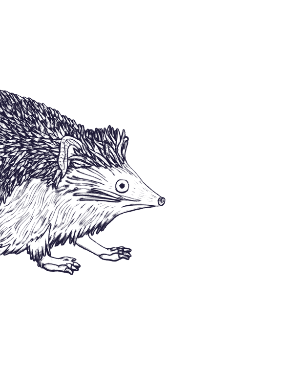
The first variant takes its inspiration from a viper known as the “haje”. A filiform and sinewy specimen,
this supple animal, with its viscous appearance and dry skin covered in scales, has given birth to a very fine,
mono-linear and fluid typeface. Extremely thin, almost invisible, this first parent is nevertheless a vertebrate,
and thus avoids the pitfall of limpness. It is intended for use in headlines, with its weight being unsuitable
for smaller text sizes. It also lays the groundwork for the family, and adopts the role of an underlying skeleton.

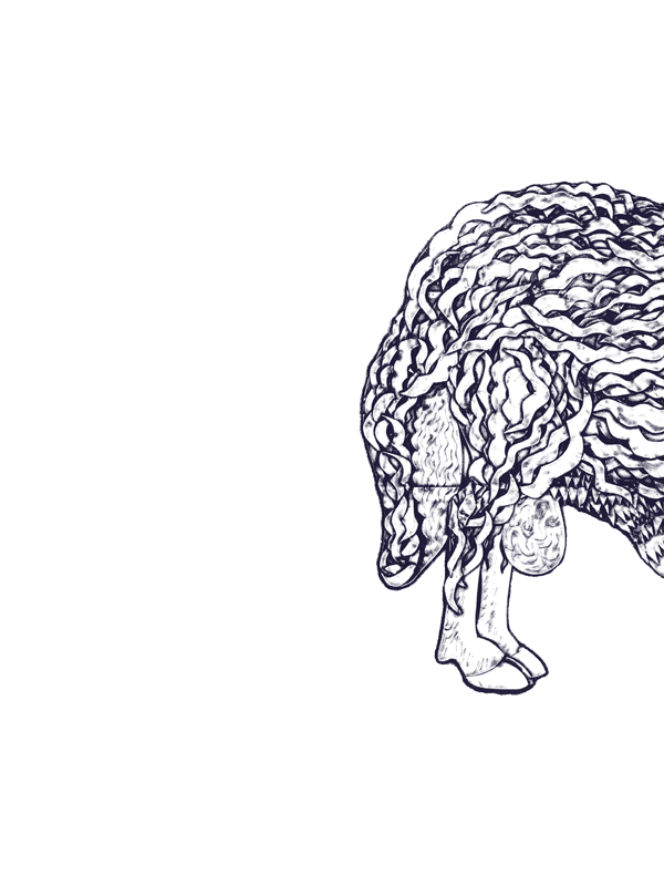
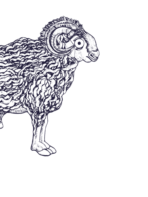
Completely different,
a second, black, variant, draws its origins from the largest mammal present in the
Description de l’Égypte: an earthy, stocky ram with a flat tail, its massive and robust body contrasts
with its thin, slender legs. Its spiral horns help to affirm its power, while its frizzy hair provides it with
a certain good nature. All features that one can find in this very thick variant, with its design that makes
subtle reference to sans serif typefaces, so popular in the nineteenth century, and that our English and German
speaking neighbours call “grotesque” types.

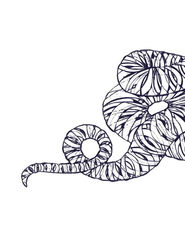
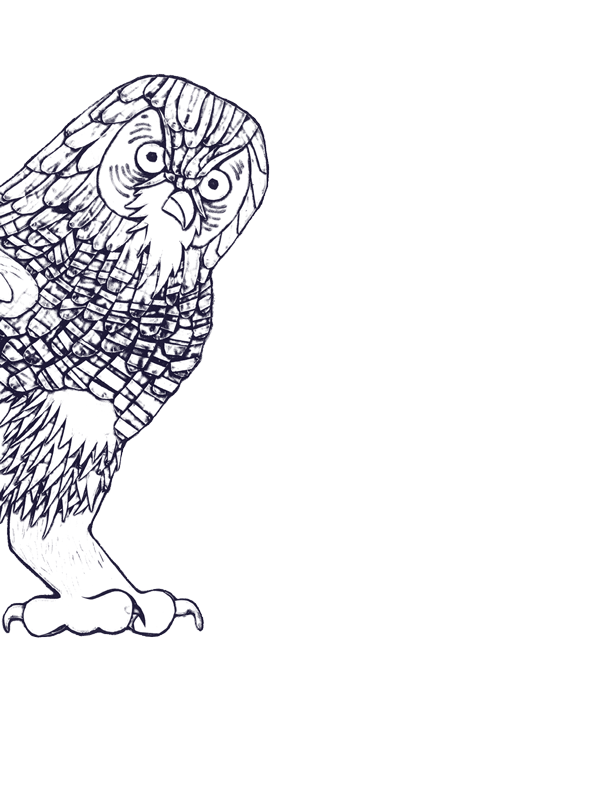
The third style, is a bold italic, whose design is based on a remarkable specimen of black ibis found
in the
Description de l’Égypte, chosen for the very characteristic undulation of its neck and the unique distribution
of its mass between a heavy body and skinny legs. The modulation of the curves and counters of this variant,
along with an unusual contrast between its thicks and thins, produce a vibration to which the eye is unaccustomed,
but one that makes a very real impression. Isn’t this what the italic aspires to do, all too often considered
as the subordinate of the roman?
Roman, bold and italic body type
These three founding members of the type family, with their very distinctive features, are then rendered “genetically compatible”
– a process called
interpolation in typeface design, which consists of an operation of calculation that allows one to generate
a number of intermediary variations between two different designs. This process thus results in three hybridizations,
which prove to be perfectly adapted to continuous reading at text sizes.
A Regular typeface and its associated Bold are first derived from the Thin and Black versions of
Faune. Displaying a slight contrast between thicks and thins, they retain the supple character of their reptilian
parent along with the robust nature of their ram parent, but to a more moderate extent. The weight of the Regular
has been chosen wisely to propose a harmonious colour for the body text. The
Bold is close enough in style to the Regular to be a dependable companion, while fully ensuring its function
of emphasis and hierarchization through
its more pronounced blackness.
The same process of interpolation has been put to use by crossing the Bold italic with the Regular, in order to generate
a Regular italic suitable for text. All while presenting proportions and a slant that are more adapted to continuous
reading, this new variant possesses the unique nature of its ibis parent. Far from the concept of a “sloped roman”,
this italic asserts a complimentary and atypical voice that is particularly suited to
emphasis. Its strangeness allows it to fully assume its role as a
disturber of rhythms in order to better distinguish, or bring to the fore different elements on the page.


A typographic chimera
This is
Faune: three master variants (Thin, Italic, Black) for large sizes, and three hybrid variants (Regular, Italic,
Bold) for body text. Beyond these six basic styles that allow a wide range of uses for print and screen, it is
possible to imagine
a potentially infinite series of variations that are more or less black, more or less slanted, thanks
to the previously mentioned process of interpolation, in this way allowing the more reptilian, earthbound or
aerial aspects of this family to be expressed.

Historically, the use of metal type meant that the physical form of letters was necessarily rigid, and the number of variants
was limited for obvious reasons linked to their costly and time-consuming mode of production. But digital technologies
today allow us a much greater flexibility in the design of typefaces. For more than three decades, increasingly
efficient software has been made available to designers, allowing them to master their design process with great
precision and extend the field of possibilities in matters of typographic creation.
While the master variants define the boundaries of the ecosystem (a.k.a the
design space) in which a type family may develop, the ability to generate multiple instances based on these
masters is the ambition of new font formats, such as
variable fonts. This dynamic format, introduced in 2016 by the principal firms of the type industry, has
shown itself to be a technological advance that is well suited to the diversity of current reading platforms
and the needs of responsive typography. It currently challenges our traditional idea of a typeface family structured
around a roman, a bold, an italic, etc., as it now gives access, within a singe file, to a multitude of variations
that have been subtly mastered beforehand: variations of weights, of widths, of vertical or horizontal proportions...thus
opening up the range of possibilities.
Faced with this ongoing upheaval,
Faune is an invitation to rethink our idea of what a type family is, while at the same time returning the
wealth and diversity of forms to the heart of the creative process. It is also an opportunity to envisage a dynamic
relationship between the variations that make it up, opening ourselves up to tomorrow’s typography: alive, mutant,
and in perpetual evolution.